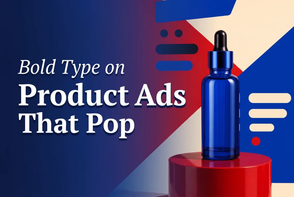
Typography product ads turn a launch into something that reads like a poster before it registers as an ad. One oversized line, a clear product silhouette, and a confident color decision can stop the scroll without a studio, a stylist, or a table full of props. The discipline is restraint: the words carry the first impression while the product stays large enough to answer what is being sold.
For a small brand shooting and editing on a phone, this is the fastest way to make a product-page banner, a launch post, a paid-social opening frame, and a short-form video all feel like one campaign. You build a single visual system, then adapt it per placement instead of designing every asset from scratch.
The five looks below combine the strongest ideas from poster-style typography and graphic color-field design. Each one is a template you can rebuild with your own packshot and headline in an afternoon.
Why typography product ads earn attention
Large type gives the eye a clear route through the frame: claim, product, detail. That sequence matters on a phone, where a viewer decides in about a second whether an ad is worth another. A short, committed statement is also easier to remember than a crowded feature list, and it survives being seen small in a busy feed.
Start with one message. New color. Limited run. One benefit. One mood. If the headline needs a second sentence to make sense, it is doing too much — let the landing page carry specifications, ingredients, and comparisons. The product should never become an afterthought either: leave breathing room around the packshot, protect label contrast, and keep the hero object front-facing when recognition matters.
Keep the product accurate. Correct color, proportions, and finish beat any elaborate background. Lean on one main contrast — a warm product against a cool field, a light object against a deep field, or a glossy surface against matte paper texture — rather than stacking competing treatments that turn the frame into a collage.
Five poster-style looks to build
Each look is a distinct art direction. Pick the one that matches your product’s personality, lock the layout, then reuse the same grid across placements so a shopper recognizes the campaign instantly.
1. The color-block launch hero
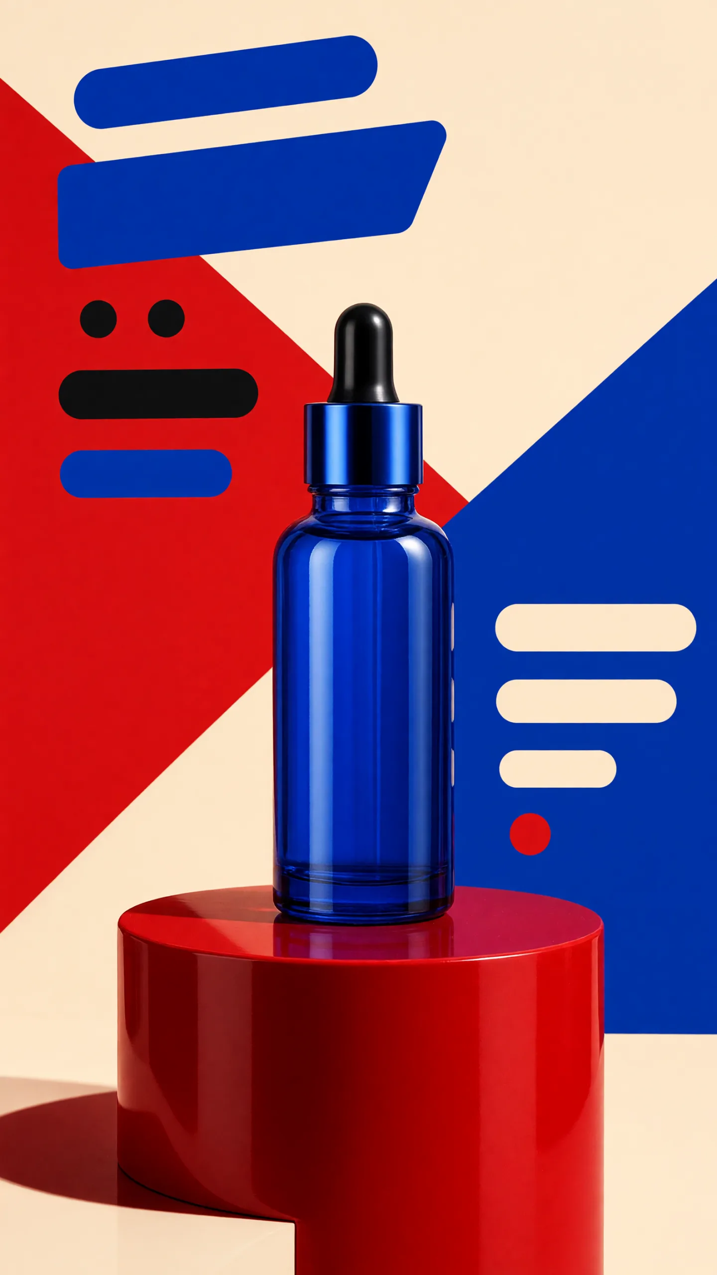
This is the cleanest route and the best place to start. Choose one saturated backdrop and one contrasting headline color, then set the product on a simple plinth or flat plane. Split the frame into two bold fields — or one large geometric block — and let the type feel architectural rather than decorative. The color blocking builds instant hierarchy: the eye lands on the field, reads the claim, then finds the product. It works because nothing competes for attention; the restraint is the design.
2. The product-as-punctuation look
Here the product literally becomes part of the sentence. Set one oversized word or short phrase across the frame and let the packshot stand in for a letter, a period, or the dot on an “i”. A lipstick becomes the stroke of a letter; a can drops into the baseline as an exclamation point. This look rewards a recognizable silhouette, so keep the object front-facing and give the surrounding letters enough weight to read as intentional design rather than an accident. It is playful, memorable, and impossible to skim past without registering the brand.
3. The sculptural shape frame
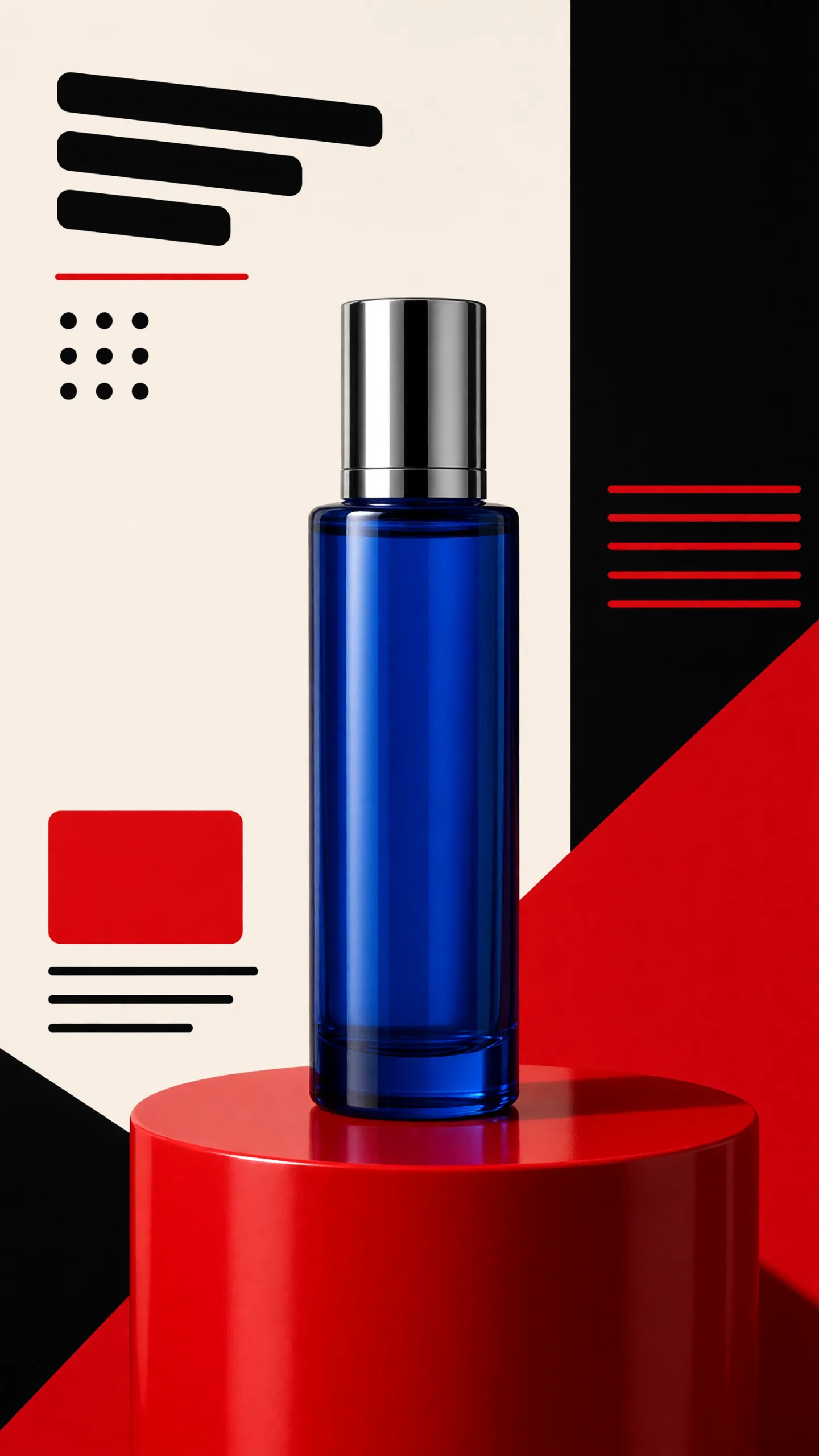
Instead of flat fields, build large sculptural forms — arches, circles, cut-paper curves, or stacked blocks — that cradle the product and carve out negative space for the headline. The shapes should feel like a set the product is standing inside, not stickers pasted on top. Add a single crisp directional shadow so the object sits convincingly in the scene. This look makes even a plain packshot feel like a considered campaign idea, and it photographs well because the forms do the styling work a physical set otherwise would.

4. The kinetic high-contrast card
This look is built for motion and thumb-stopping punch. Push contrast to the maximum — a light object on a deep field, or a glossy product against matte texture — and set the type on a diagonal or in a tight, energetic stack so the frame feels like it is moving. It is the natural choice when your ad will become a reel cover or the opening frame of a short video, where the first quarter-second has to land. If you plan to animate the layout, the same high-contrast composition translates cleanly into a video ad; a tool like Prodvid, our team’s iOS app for product video ads, can turn this static card into a short motion piece without a separate editing suite.
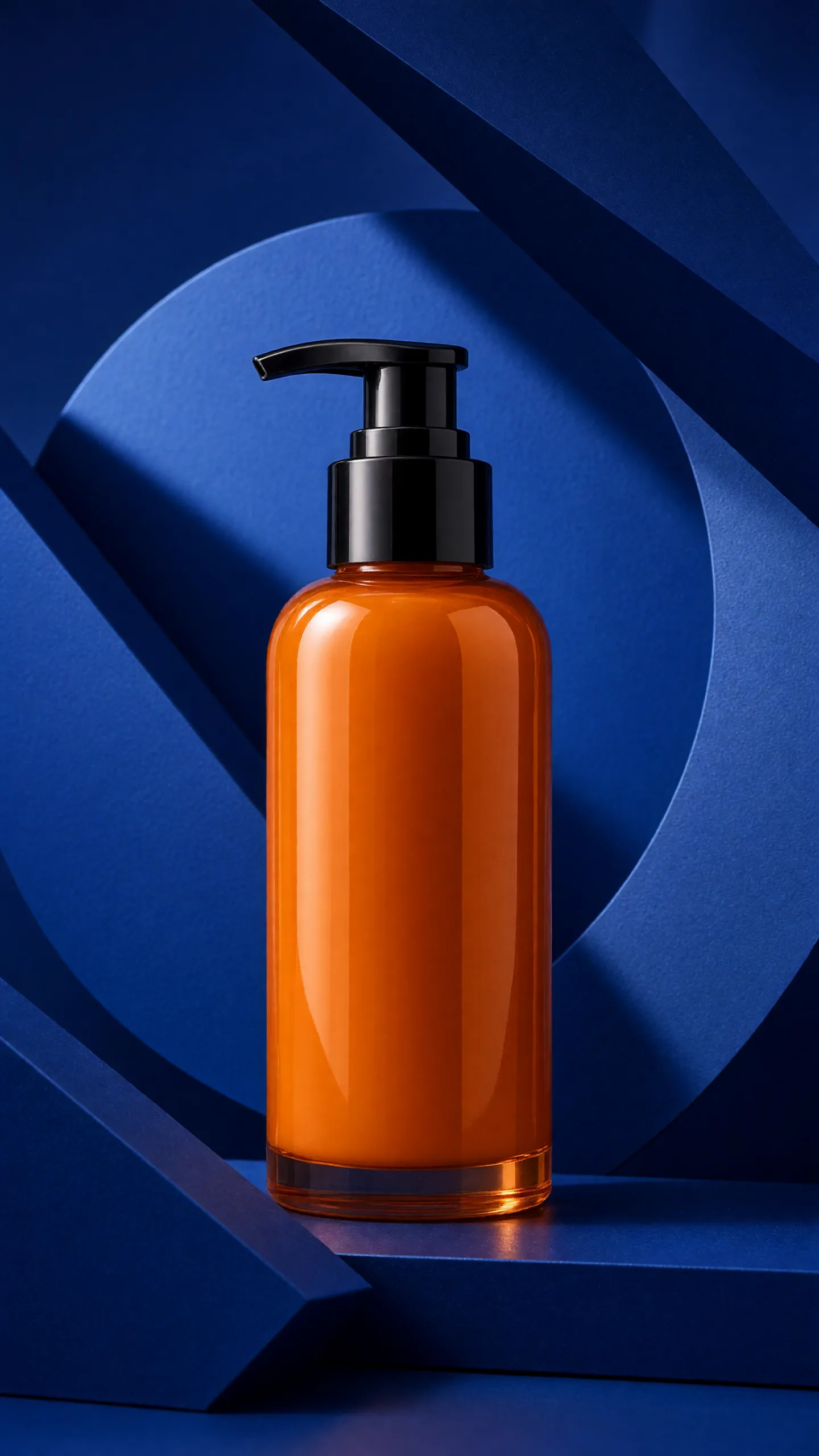
5. The editorial limited-drop / offer-ready panel
The final look borrows from magazine covers and works hard when there is an offer or a launch date to announce. Use a refined serif or a condensed grotesque, a tight editorial grid, and one small block reserved for the detail that drives action — limited run, ships Friday, 20% off launch week. Keep the palette narrow and the type hierarchy clear: a large claim, the product, then the small offer line. Because this panel is offer-ready, it slots straight into promotions without a redesign; you swap the date or discount and keep the rest of the system intact. For a complementary way to add polish to the packshot itself, see our guide to the prism packshot effect for phone ads.
A copyable design and shot checklist
Run through this before you export. Copy it into your notes and reuse it for every variant so your placements stay consistent.
- One message only — claim, product, detail; if it needs a second sentence, cut it.
- Packshot front-facing, correct color, proportions, and label; recognizable at thumbnail size.
- Two-color palette maximum, with one clear main contrast between product and field.
- Negative space reserved for the headline before you place any type.
- One crisp directional shadow so the product sits in the scene, not floating on it.
- Type large enough to read on a phone; test at feed size, not full screen.
- Safe margins clear of platform UI (captions, buttons, profile overlays).
- Export a 4:5 and a 9:16 crop from the same layout so one design covers feed and stories.
- Change one variable at a time when testing — palette, form, or lighting — never all three.
A reliable starting prompt if you generate backgrounds: premium product poster for a [product], [two-to-four-word headline], oversized condensed lettering, large sculptural color blocks, [two-color palette], centered accurate packshot, crisp directional studio shadow, clear negative space for headline, clean editorial layout, no logo distortion. Swap one clause per test.
Key takeaways
- Typography product ads win on restraint: one message, one contrast, one hero object.
- Build a single visual system, then adapt the five looks across feed, stories, video, and email.
- Keep the packshot accurate and front-facing — type sets the mood, the product closes the sale.
- The editorial offer-ready panel makes promotions a swap, not a redesign.
- Test one variable at a time so you learn which look actually moves the click.