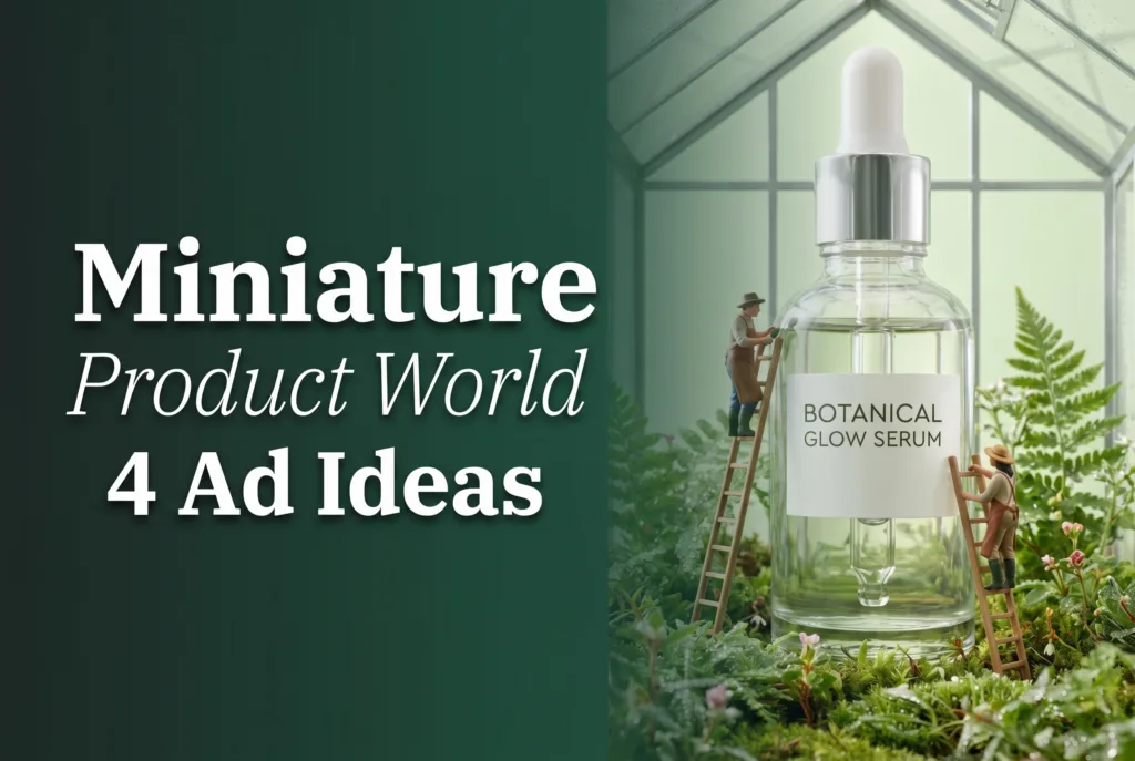
Miniature product world creative turns a packshot into a place: a lipstick towers over a shopping street, or a serum bottle becomes the centerpiece of a glasshouse. For a small brand, the appeal is practical as well as playful. You can begin with one clean phone photo, develop a strong visual premise, and plan several ad shots without hiring a full set-building crew.
The best versions do more than add tiny figures around a giant object. Their setting translates a product benefit into a scene people can understand quickly. This guide shows how to choose that connection, art-direct four useful concepts, and shape the result into a phone-made product ad that still feels recognizably yours.
Build a small world around one product message
Start with the reason someone would want the item, then imagine a location where that reason becomes visible. Long-wear lipstick might suggest a busy evening district. Botanical skincare belongs naturally in a working greenhouse. A trail shoe can reshape the terrain, while an insulated tumbler can serve as the center of a cold-weather camp. This benefit-first approach gives every prop a job.
Scale is the attention device, not the whole idea. Let the product occupy the largest, cleanest shape in the frame. The miniature activity should lead the eye toward its silhouette, label, opening, sole, or material finish. If the tiny scene remains interesting after the product is mentally removed, the background may be competing too hard.
Before making anything, photograph the item near a window against an uncluttered surface. Use the main camera rather than digital zoom, wipe glossy packaging, and shoot straight enough to preserve the real proportions. Capture one label-facing view and one slightly angled view. Those simple originals give you options while helping you spot warped typography or invented hardware later.
Four miniature product world looks to adapt
1. Make lipstick the high street landmark
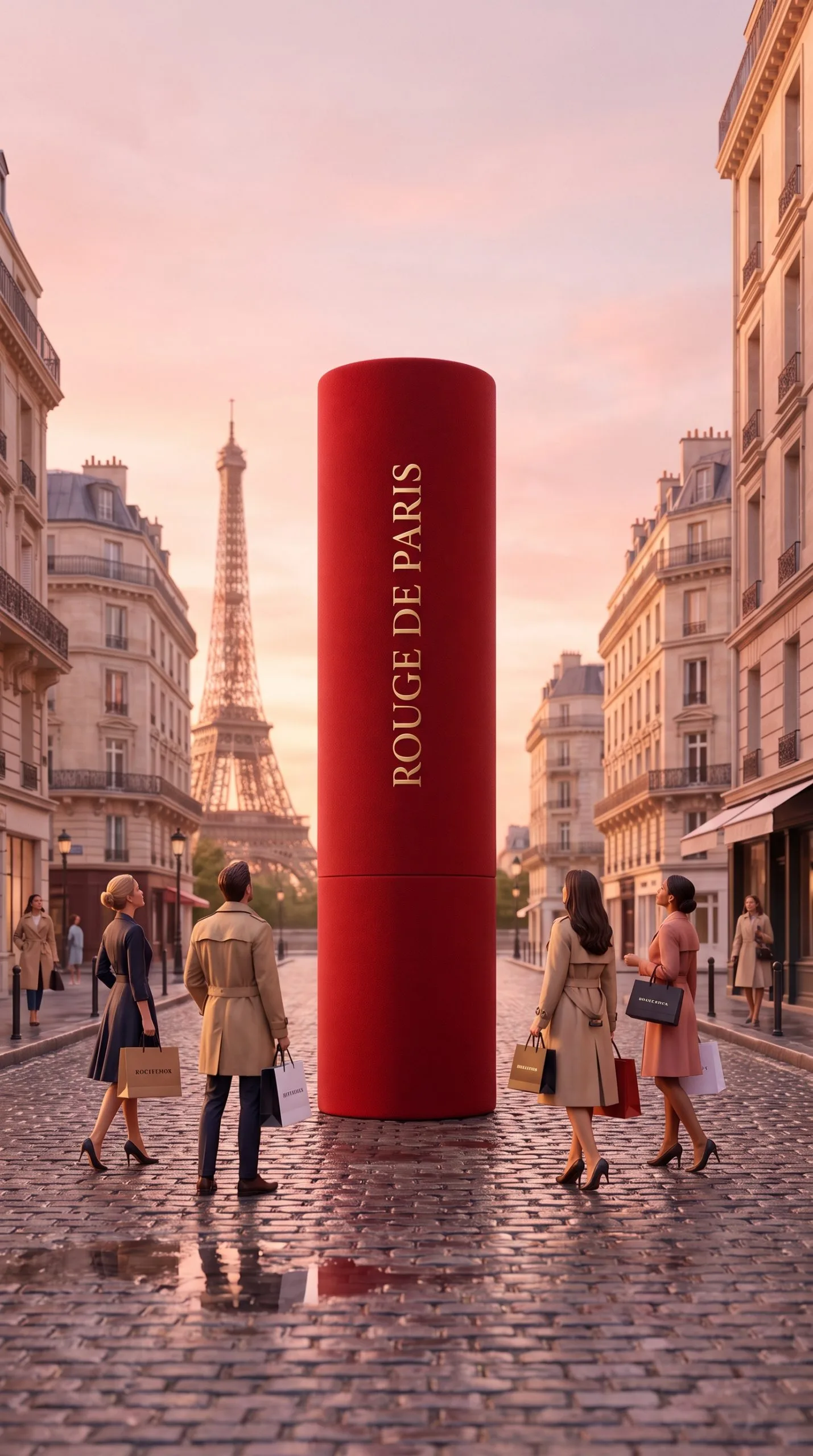
Treat the lipstick tube like a piece of architecture at the end of a compact retail avenue. Tiny window displays, pedestrians, delivery bicycles, and café lights can establish the setting, but repeat the lipstick color sparingly in awnings or signs so the eye returns to the product. An eye-level street perspective makes the tube feel tall without hiding its branding.
This direction can sell more than glamour. A morning version might communicate everyday ease; an evening version can support a launch or limited shade. Keep small people away from the cap seam and logo, and reserve a quiet patch of pavement or sky if the final ad needs a price or shade name.
2. Grow a working greenhouse around serum
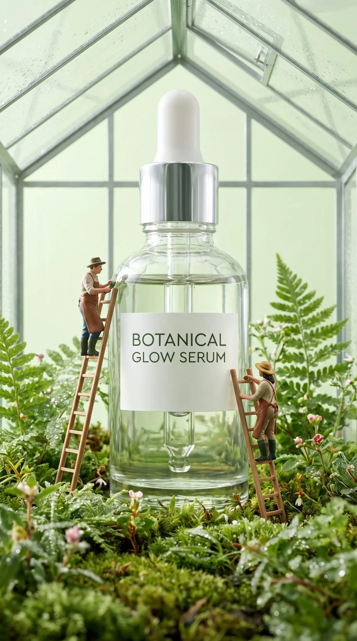
Place the serum as the central glass structure rather than dropping it into a random pile of leaves. Miniature gardeners can inspect seedlings, wheel small carts, or tend vines that curve toward the bottle. Choose plants associated with the formula only when that relationship is accurate; otherwise, use greenery as a broad freshness cue rather than implying an ingredient claim.
Translucent packaging needs careful lighting. Soft side light can define the bottle edge, while a brighter glow behind it suggests clarity. Keep condensation subtle and make sure the dropper, liquid level, and printed text remain plausible. A limited palette of leaf green, warm soil, and the label color usually reads better on a phone than dozens of competing flowers.
3. Turn a running shoe into the route
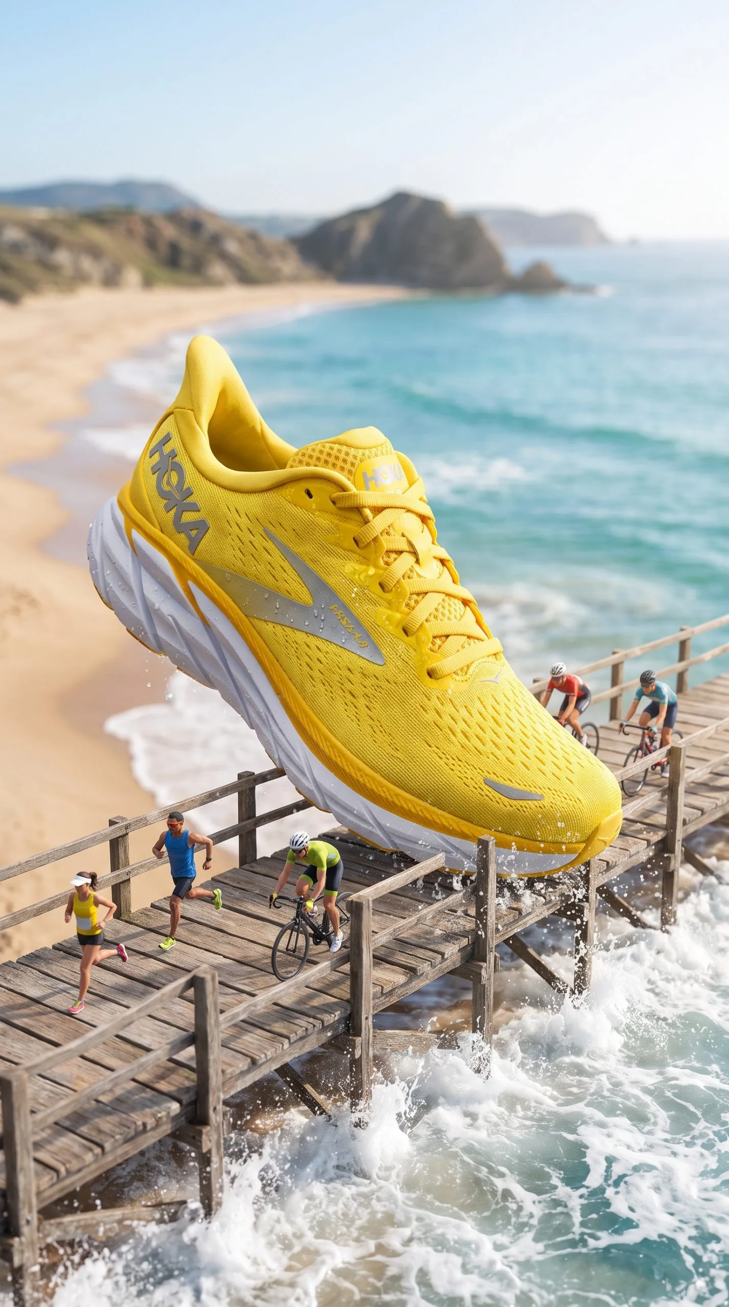
Instead of placing runners beside the shoe, design their route around its real features. A path can climb toward the heel, pass beneath an arch, and continue alongside the outsole. This makes cushioning, grip, or stability part of the narrative. Use repeated trail markers or lane lines to connect the tiny athletes and prevent the scene from becoming a collection of unrelated actions.
A low three-quarter view reveals both profile and sole, which is useful when the design language lives in those areas. Directional light and a little kicked-up dust imply speed even before animation. Preserve lace count, panel shapes, and tread geometry: shoppers who know footwear notice those details, and visual accuracy is more persuasive than extra spectacle.
4. Establish base camp around a tumbler
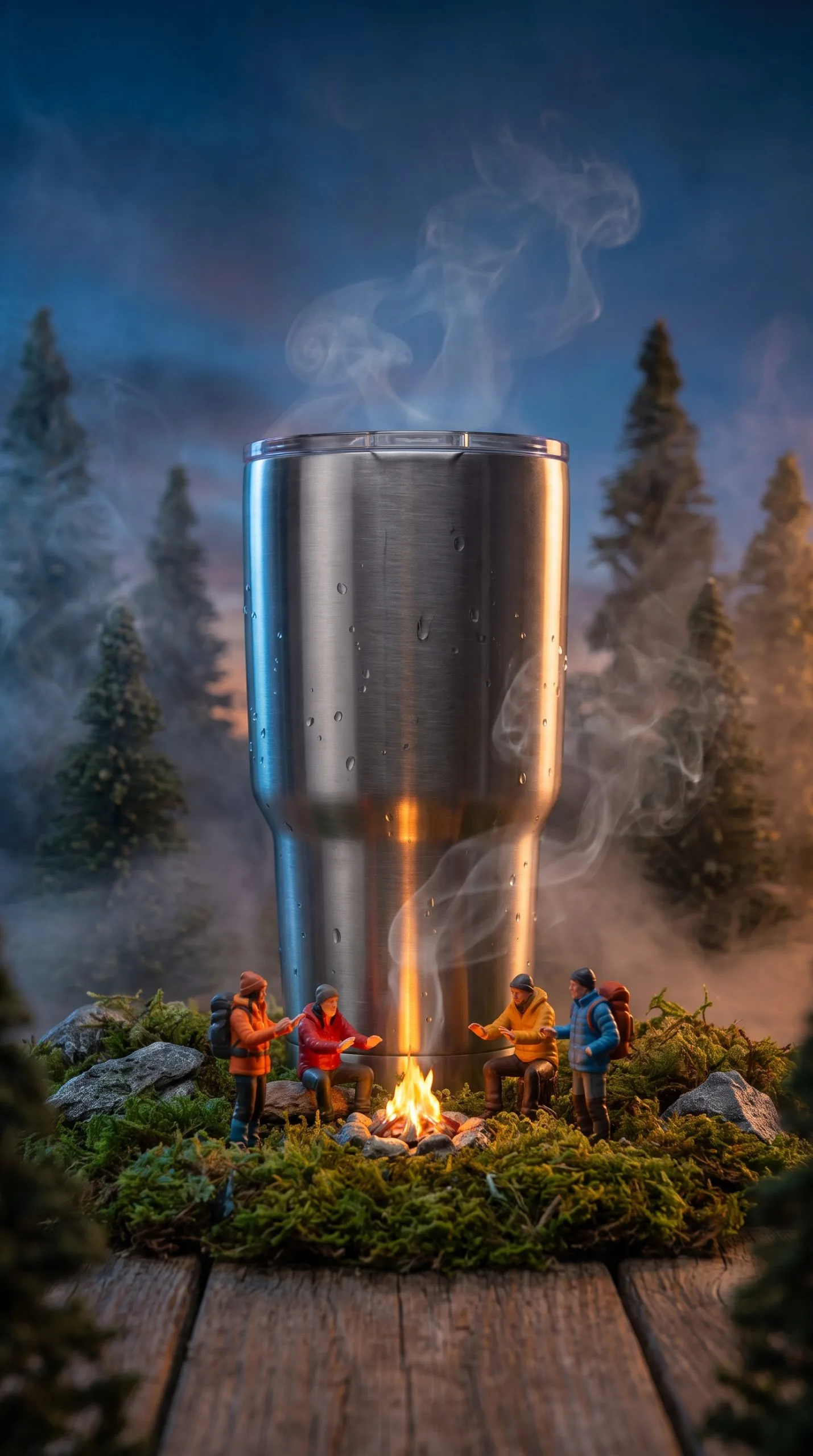
Build the campsite in a loose ring around the tumbler, using tent entrances, footpaths, and seated hikers to point inward. The vessel should feel like essential gear rather than a monument accidentally left outdoors. A lid-side angle can reveal the drinking mechanism, while a brushed-metal highlight communicates finish without turning the entire surface white.
Blue-hour color creates useful contrast: cool surroundings make a small campfire and warm tent lights stand out. Steam can hint at heat retention, but it should rise from the actual opening and match the conditions. If the brand promise centers on cold drinks, replace the fire with a sunlit trail stop, visible ice, or droplets rather than mixing incompatible signals.
Move from packshot to a short phone-made ad
Choose one of the four worlds and create a still that works at vertical-ad size. Review it at the same small scale viewers will see, not only while zoomed in. Check the logo letter by letter, compare edges and closures with your source photo, and remove any miniature prop that touches important copy. Keep a clean product image available for the closing frame.
Next, plan motion as a reveal rather than animating everything. Open on one tiny action, pull back to expose the surprising scale, drift toward the product benefit, and finish with the accurate packshot. In the greenhouse, that could mean a cart moving past seedlings before the camera reveals the serum. At base camp, a lantern can lead into a wider tumbler view. One clear movement per beat is easier to read than simultaneous smoke, crowds, foliage, and camera shake.
If you want an assisted mobile workflow, Prodvid for AI product video ads is our team’s iOS app. Use it as a production aid, then apply the same brand review you would give any commissioned creative: packaging fidelity, readable claims, consistent colors, and a clean final offer.
Export a short master, then make variations by changing the opening action or on-screen message—not the product identity. A lipstick-city cut might test shade-first text against occasion-first text. Keeping the world stable makes that comparison more useful because the message is the main variable.
Copyable miniature product world brief
Product: [exact item and color or variant]
Single benefit: [one promise the scene should communicate]
World: [location that makes that benefit visible]
Tiny action: [one activity that leads attention to the item]
Must preserve: [logo, silhouette, cap, texture, sole, or other identifiers]
Lighting and palette: [time of day, two main colors, one accent]
Sequence: [close detail] → [scale reveal] → [benefit moment] → [clean packshot]
Ad copy: [hook of five to eight words] + [offer or proof point]
Fill this in before generating or compositing the scene. It is short enough to paste into a notes app and specific enough to keep a solo creator, editor, or collaborator aligned. For a campaign, duplicate the brief and alter only one field at a time so you can tell which creative choice changed the result.
Key takeaways
- Connect the miniature setting to one product benefit before choosing props.
- Make the real item the clearest and largest visual shape, with tiny action directing attention toward it.
- Use accurate phone photos and protect the identifiers shoppers rely on.
- Give lipstick, serum, footwear, and drinkware distinct worlds rather than applying one generic miniature treatment.
- Animate a simple reveal, end with a trustworthy packshot, and vary one campaign element at a time.
A convincing small-scale fantasy is tightly edited. When setting, movement, and light all reinforce the same reason to buy, the visual joke becomes a usable product story—one a small brand can plan, shoot, and refine from a phone.