Floating fabric product effect is the trick that makes a flat phone snapshot look like the opening frame of a polished product reel. A single ribbon of organza, silk, mesh, or satin curls around your item, gives the eye a path to follow, and then clears away so the label and shape stay easy to read.
The reason it works is simple: motion pulls attention, but the product stays the destination. Done well, the fabric feels expensive without hiding what you are actually selling.
This guide is written for small brands shooting ads on a phone. No studio, no crew, no big budget. Just a clean base shot, one good fabric idea, and a frame a shopper can read in a second.
Why the effect earns its place
A plain packshot tells a shopper what the product is. A floating ribbon tells them how it feels. That difference matters most in the first half-second of a scroll, where a static image often loses to anything with implied movement.
The fabric does one job: it draws a line toward your hero and frames it. It should never wrap the center of the product, cover the label, or turn the frame into a puzzle. When you keep that discipline, the same still works as a store hero, an email banner, or the first card in a paid carousel.
Build a clean base on your phone
Start with a front, three-quarter, or side view that shows the product clearly, and shoot against a calm background. A pale sweep, a single-color backdrop, or a soft gradient gives the fabric room to move. If the wall-to-table line is visible, drape a sheet of paper into a curve so there is no hard horizon behind the object.
Pick the fabric before the color. Organza reads light and airy. Satin catches harder highlights and feels formal. Mesh brings texture, though it can turn a small label busy. For a skincare bottle, reach for something sheer; for footwear or a can, use a broader ribbon with a sharper curve. Whenever you can, keep the fabric behind the hero face.
The safest setup is a single ribbon with one clear task: frame a bottle neck, lead toward a shoe toe, or float a loose halo around a box. Multiple ribbons can look rich, but they also make a phone frame hard to scan. If you want a sharper, more graphic alternative to soft fabric, the prism packshot effect for phone ads is a good companion technique.
Four looks to try
Each look below pairs a fabric choice with a product category. Match the mood to what you sell, then keep the execution restrained.
Look 1: The soft skincare halo
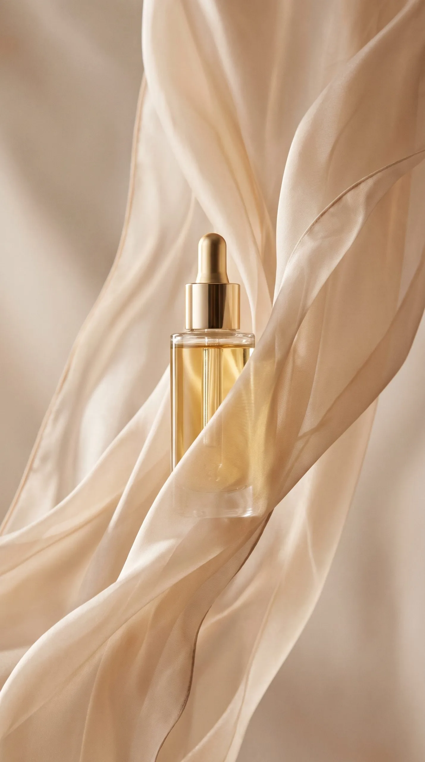
Use pale peach, cream, or a shade pulled from the packaging. Stand the serum bottle upright and let translucent fabric rise behind the cap, then fall outside the bottle edges with a clear gap around the front label. This soft frame suits serums, moisturizers, candles, and delicate launches because it adds elevation without swallowing the product. If the label starts to warp, shorten your instruction and lock the bottle shape, label, and cap before adding any mood words.
Look 2: The sculptural homeware reveal

For a vase, mug, lamp, or small decor piece, use a thicker ribbon that makes one intentional loop. Place the loop high on one side and let the tail land low on the other; that diagonal keeps a static object from feeling flat. Choose matte fabric for ceramic and linen, and reserve satin for products that already have polished surfaces. Keep the loop open — fabric pressed against the item can make it look misshapen.
Look 3: The fast footwear sweep
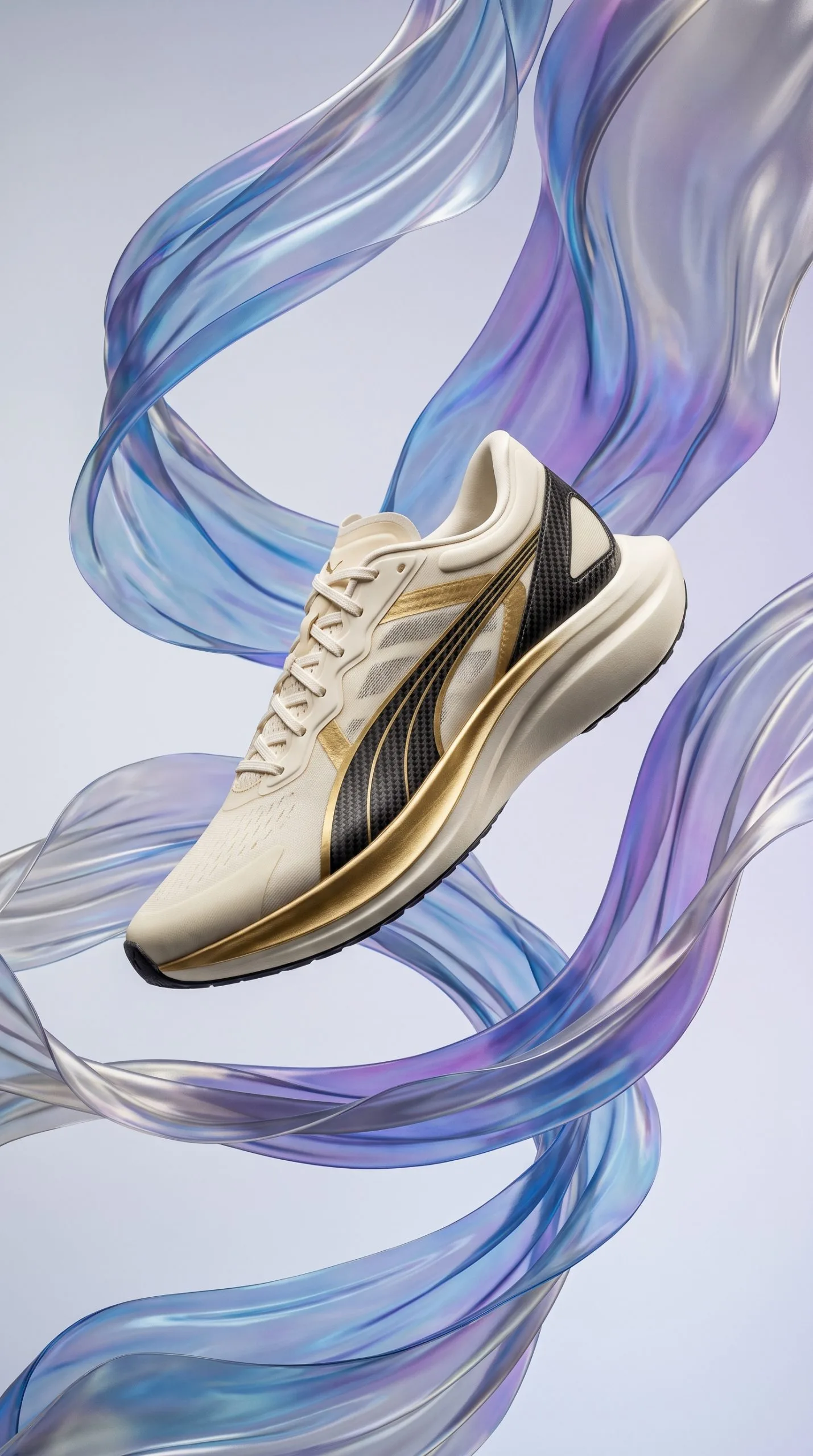
Footwear wants energy. Run a long ribbon in behind the heel, curve it under the midsole, and let it fly out past the toe. Hold a short, soft shadow right under the shoe so it still looks grounded rather than falling. This makes a strong first frame for a new colorway, a limited drop, or a paid social carousel. If the fabric crosses the laces or outsole, push it behind the shoe on your next take so the product wins the race for attention.
Look 4: The glass-and-silk fragrance frame

Glass rewards restraint. Pick a fabric that matches one secondary note in the packaging: burgundy for a warm scent, smoky blue for a fresh one, or champagne for a gift set. Light the bottle from the side so the glass edges separate from the background, and let the fabric pass behind the neck instead of wrapping its center. This treatment fits gifting pages, collection banners, and the first slide of a seasonal launch.
A copy-paste shot brief
Run through this checklist before you press record or generate a frame:
- Product is front, three-quarter, or side on — label and cap clearly visible.
- Background is a single color, soft gradient, or curved sweep with no hard horizon.
- One fabric chosen, in one brand-adjacent color.
- Ribbon sits mostly behind the hero and never crosses the label.
- A short, soft shadow keeps the product grounded.
- Frame leaves clean space for a price, offer, or short headline.
Prompt and production tips
If you are generating the image, describe things in this order: product material and angle, then whether the label must stay visible, then the background, then the fabric color, material, and route through the frame, and finally lighting plus one quality cue like crisp edges or controlled shadow. That sequence keeps the fabric from taking over the picture.
Product first, fabric last. If the ribbon is the first thing you notice, you have written the prompt backwards.
For a video version, animate only one movement — a slow lift, a sideways sweep, or a gentle unfurl. Show the product in the first half-second and end on a stable close crop with room for a headline. If you would rather turn a single photo into a short vertical ad without editing software, our team’s iOS app Prodvid can build that motion frame for you.
Keep it sellable on a small screen
Check the image at thumbnail size before you publish. Could a stranger name the product in a single glance? Is the label, cap, closure, or key material still legible? If either answer is no, cut back the fabric. Stick to one brand color and one neutral background, keep hard reflections off metallic packaging, and avoid busy fabric patterns that clash with printed labels.
A great frame feels deliberate, yet it never makes the shopper guess what is on sale.
Key takeaways
- One ribbon with one job beats a frame full of fabric every time.
- Keep the fabric behind the hero and off the label so the product stays readable.
- Match the fabric weight and color to the category — sheer for skincare, matte for homeware, long sweeps for footwear, restrained silk for fragrance.
- Ground the product with a soft shadow and leave space for a headline or price.
- Test at thumbnail size: if the product is not obvious in a second, simplify.