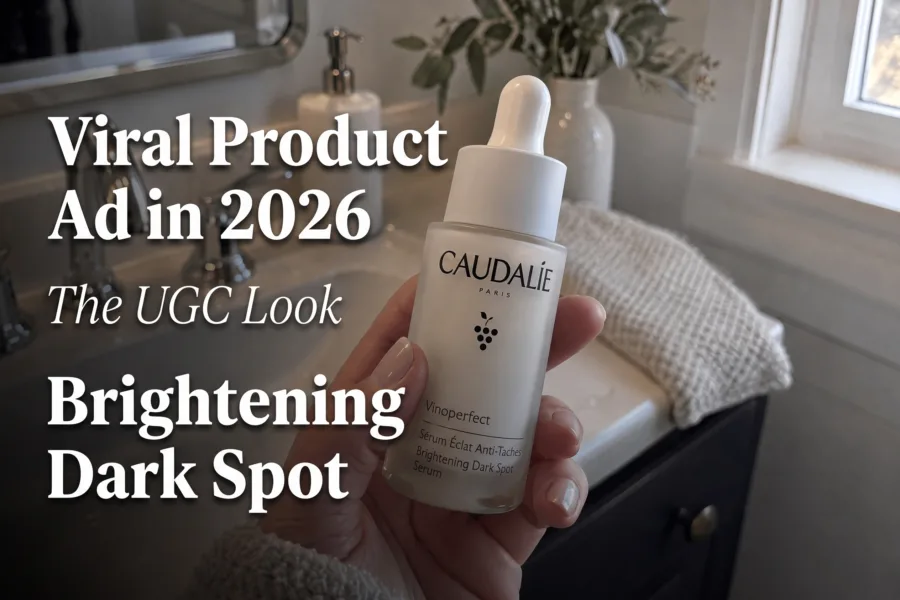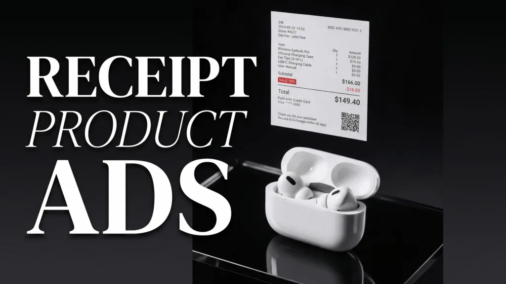
Receipt product ads turn the familiar shape of a purchase receipt into the visual spine of a product creative. This guide is for small brands and sellers who want a graphic, retail-inspired look they can build from one clean product photo and adapt into a short phone-made video.
For the strongest result, keep the product larger than the receipt, use one clear message, and reveal details in a deliberate order. The receipt should frame the buying story—not imitate real paperwork. Start with a clean hero shot, add a restrained paper strip, then animate one element at a time.
You will find four layouts, a seven-step phone workflow, a copyable creative brief, and practical checks for keeping small type readable.
Why do receipt product ads work?
Receipt product ads work because they combine a recognizable shopping cue with an unexpected composition. A long paper strip gives the eye a path through the frame, while the product supplies the focal point. The result can suggest checkout, value, a new drop, or a post-purchase moment without needing a complicated set.
The look is especially useful for compact products that can disappear in a wide frame. A receipt shape adds scale and structure around sneakers, bottles, earbuds, coffee packs, candles, and accessories. It also creates natural beats for video: product first, item line second, total or offer last.
Do not make the paper look like a genuine transaction record if it is not one. Treat it as an art-directed graphic device, and label any price or offer accurately. If the design includes fine print, it still needs to remain legible where the ad will actually appear.
4 receipt product ad layouts to try
1. The bold ribbon
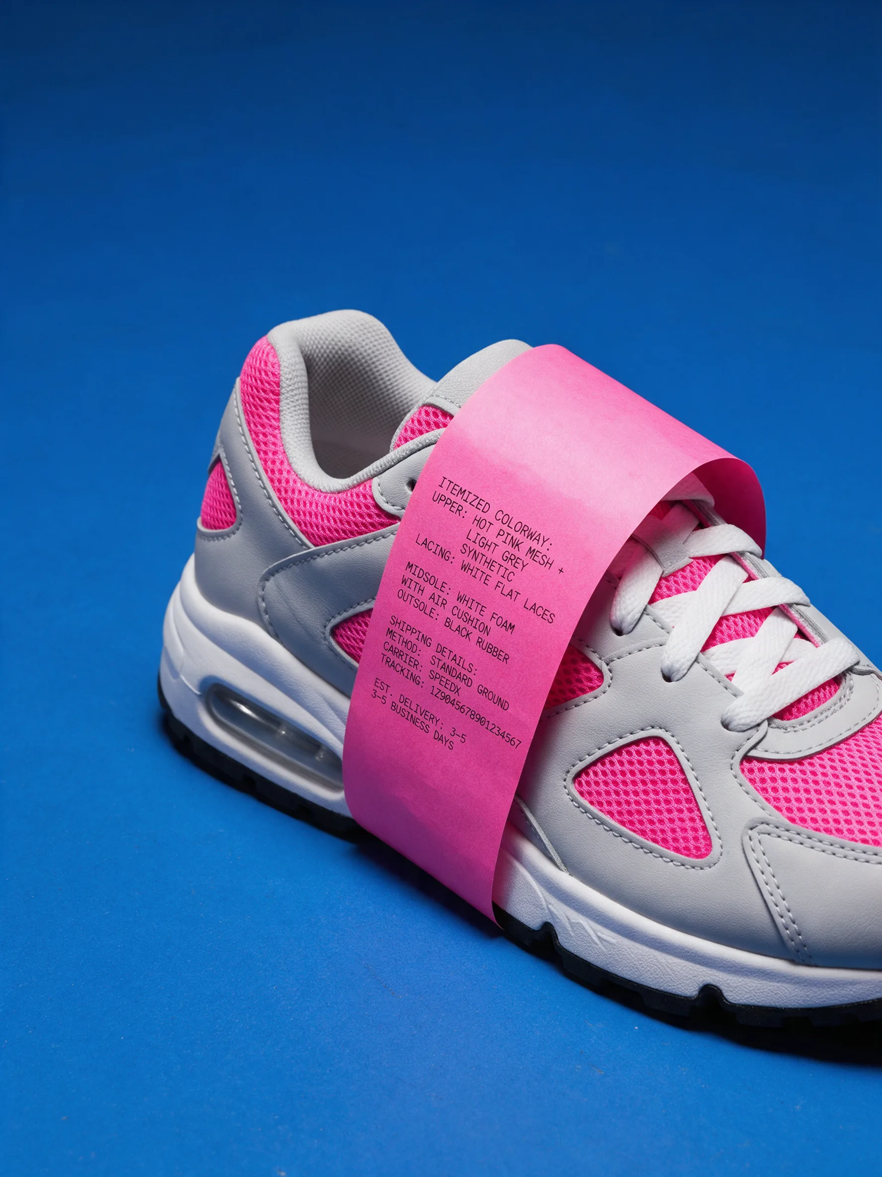
Run an oversized receipt diagonally behind or beside the product. Use one accent color that contrasts with both the paper and the background. This layout suits footwear, streetwear, bags, and launch campaigns because the long strip creates movement even before animation begins.
For video, slide the strip into frame, hold on the product, then reveal one short line. Avoid filling every row. A mobile viewer should understand the main point before trying to read supporting details.
2. The quiet benefit card
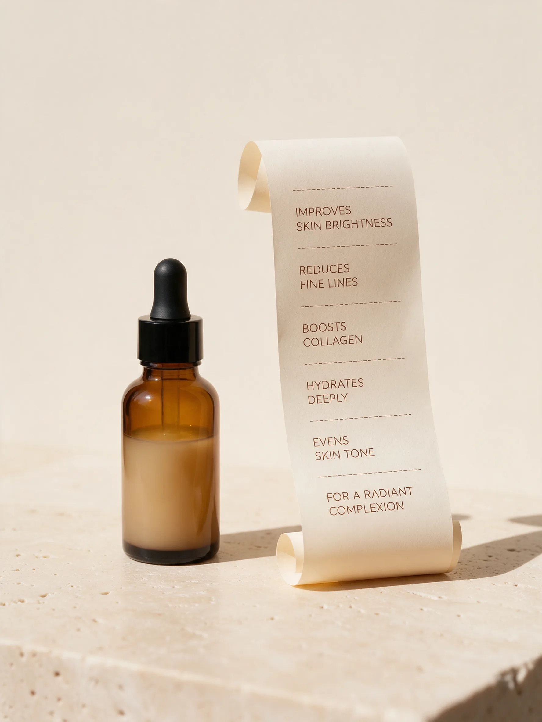
Place a short receipt card near a skincare, wellness, or beauty product and use it like a restrained specification sheet. Keep the palette close to the packaging, then create separation with texture: smooth glass against torn paper, or matte packaging against stone.
Make the first line a real, supportable benefit or product detail. The next line can name a material, size, scent, or use case. This is a calmer alternative to a sale-first creative and works well when the packshot already carries visual interest.
3. The structured tech card
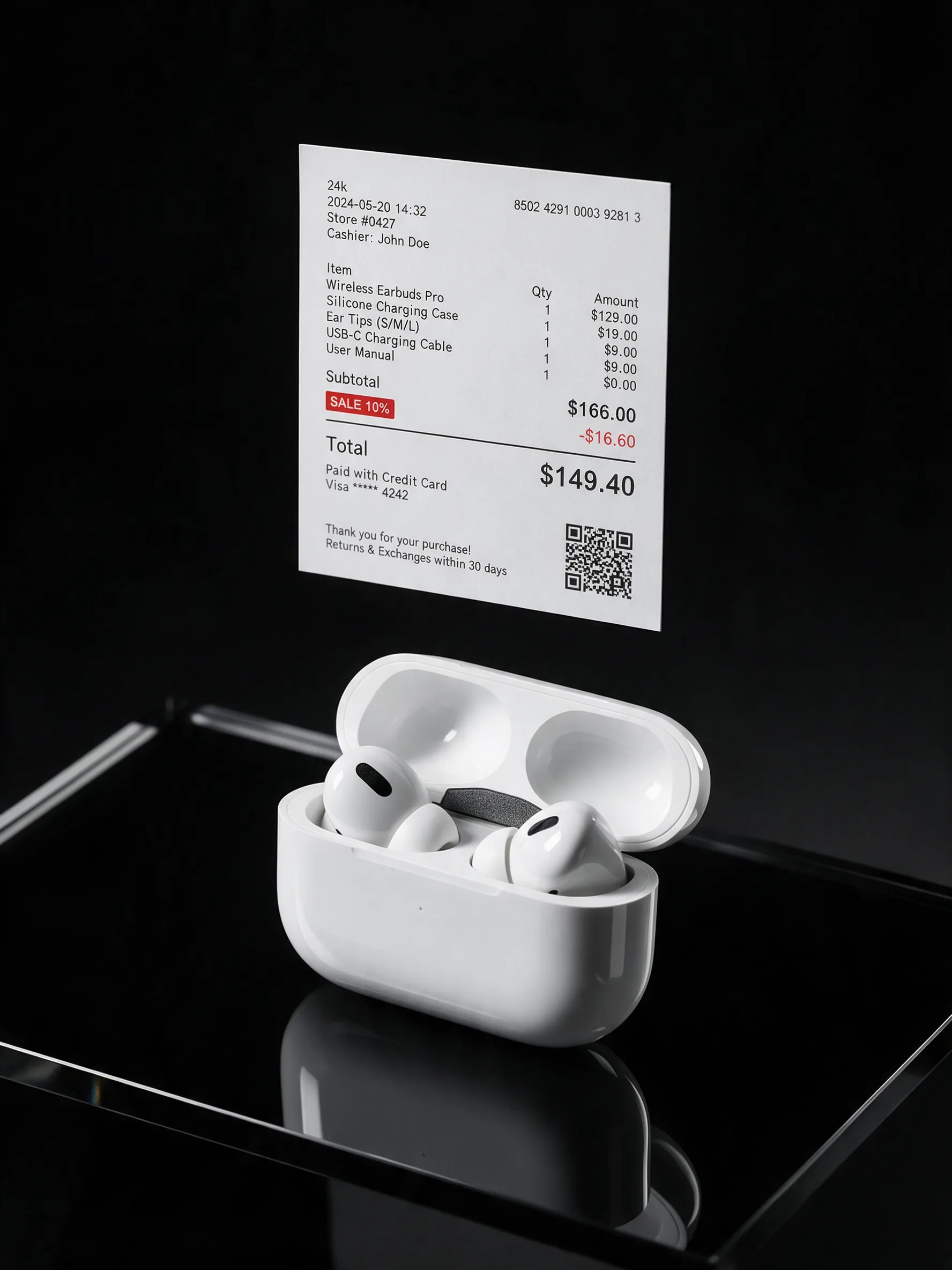
Use a blockier receipt beside a compact gadget, with a few aligned rules and generous margins. The visual system can feel technical without pretending to be an interface. Skip decorative QR codes and fake controls in your final version; they add clutter and can imply functionality that is not there.
Animate the product rather than the small type. A slow turn, shadow shift, or simple scale change is easier to follow than many lines appearing at once.
4. The curling paper trail
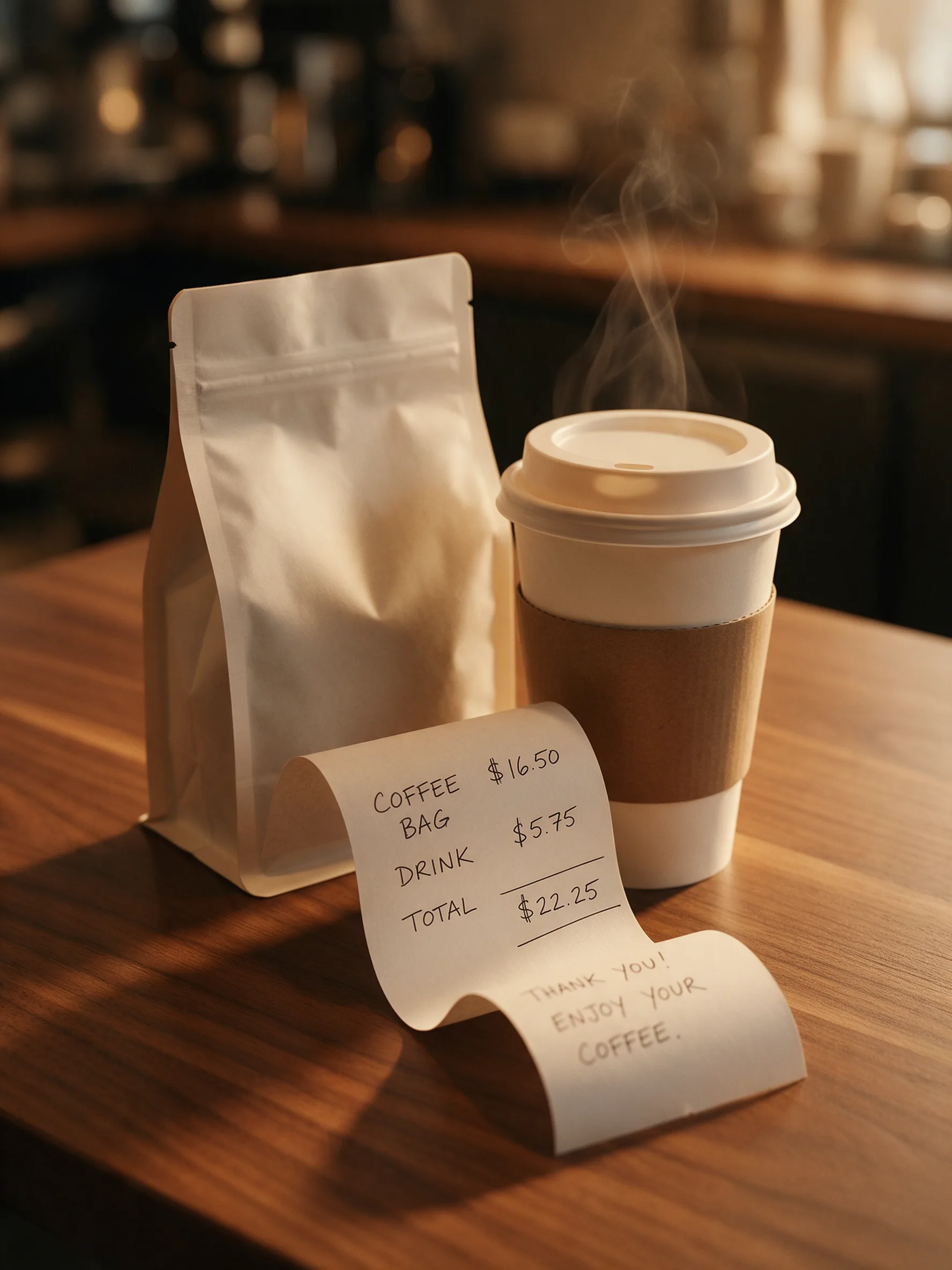
Let a receipt-like strip curve through a lifestyle scene instead of sitting flat. Coffee, pantry goods, candles, stationery, and home accessories benefit from the softer shape. Keep the paper behind the front edge of the pack so the product remains visually dominant.
This version is well suited to a three-shot sequence: wide scene, close texture, final packshot. If you need a simple structure for those clips, use this 15-second product video storyboard and replace its middle beats with the paper reveal.
How do you make a receipt product ad on a phone?
Build the ad from one controlled product shot and a short hierarchy of information. The workflow below keeps the graphic idea from overwhelming the item being sold.
- Shoot a clean packshot. Use soft window light or a diffused lamp, lock focus, and leave negative space for the paper element.
- Choose one story. Decide whether the receipt signals a launch, a bundle, a product detail, or a purchase moment.
- Write three lines. Use a product name, one accurate detail, and one accurate price or action. Remove everything else.
- Build the paper shape. Photograph a blank strip or make a simple graphic layer with wide margins and high contrast.
- Set the hierarchy. Keep the product largest, the lead line second, and any supporting line third.
- Create motion beats. Reveal the product, then the strip, then the final message. For an AI-assisted route, you can turn your product image into an AI product video ad with Prodvid, our iOS app, while keeping the same three-beat plan.
- Review at actual size. Watch once with sound off, pause on every message, and confirm prices, claims, spelling, and product appearance.
Copyable receipt ad creative brief
Product: [name and variant]
Single message: [launch, bundle, detail, or offer]
Receipt lines: [product name] / [one accurate detail] / [price or action]
Visual contrast: [one accent color or material contrast]
Three beats: product appears / paper enters / message resolves
Final check: product accurate, offer current, text readable, no invented codes
How do you keep small receipt text readable?
Design for the smallest placement, not the editing canvas. According to the W3C Web Content Accessibility Guidelines 2.2 (2023), normal text should have a contrast ratio of at least 4.5:1. Although an ad image is not a web page, that threshold is a useful minimum check for receipt text placed over colored paper.
According to W3C WCAG 2.2 (2023), text should also be resizable up to 200 percent without loss of content or functionality. A video graphic cannot offer browser zoom, so perform the practical equivalent: enlarge the preview, crop it to a typical phone feed, and make sure the main line survives both scaling and compression.
- Use one or two type sizes, not a miniature receipt simulation.
- Keep essential words away from folds, highlights, and moving edges.
- Show one message per beat.
- Test the muted version; the visual order should still make sense.
- Remove any line that requires pinching or pausing to decipher.
FAQ about receipt product ads
What products suit receipt product ads?
Compact, clearly shaped products suit receipt product ads best. Sneakers, skincare, coffee, candles, accessories, supplements, and small gadgets leave room for the paper device without becoming hard to recognize. Larger products can still work, but the receipt should become a smaller supporting card rather than a competing object.
Should a receipt ad show a real price?
A receipt ad should show a real, current price if a price is included. If pricing varies, use a non-price detail or an accurate action instead. Do not invent discounts, totals, transaction IDs, reviews, or urgency. The format can evoke checkout without pretending that a fictional purchase happened.
How much text belongs on the receipt?
Three short lines are usually enough for a phone-first creative: the product name, one accurate detail, and a price or action. Decorative rows may make the prop look realistic, but they compete with the message. If a line cannot be read in the final placement, remove it rather than shrinking it.
Can receipt ads work without typography animation?
Yes. The paper itself can provide the motion through a slide, curl, pull, or stop-motion change. Keep the text static and animate the product, shadow, or strip. This often produces a cleaner result because viewers do not have to read while every letter is moving.
Key takeaways
- Make the product the largest and clearest element in the frame.
- Use the receipt as a buying-story cue, not fake proof of a transaction.
- Limit the paper to three accurate, readable lines.
- Reveal the creative in three beats: product, paper, final message.
- Review claims, prices, contrast, and product accuracy before posting.