Product video morph transition is a scene-change technique that keeps the product visually anchored while its surroundings transform. It gives small brands a clear before-and-after story without requiring several physical sets.
A strong product video morph transition uses one stable product image, two clearly different environments, and a change that supports the message. Keep the pack orientation, scale, and color consistent while the background shifts. The result should communicate an idea—refreshment, versatility, seasonality, or transformation—rather than motion for its own sake.
This guide is for sellers who have a clean product photo and need a practical creative direction for a short social ad.
Why does a product video morph transition work?
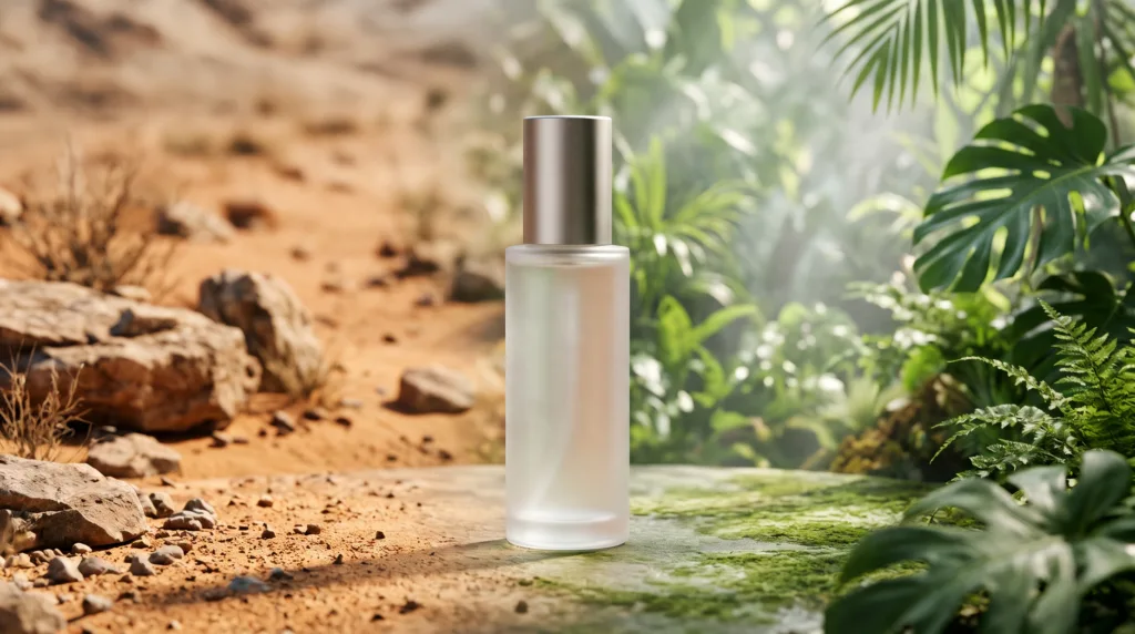
It works because the viewer can compare two settings without losing the subject. The product becomes the visual constant, while the changing environment carries the story. A bottle moving from a dry landscape to a lush one can suggest refreshment; a candle moving from daylight to evening can suggest a shift in mood.
The transition is most useful when the two scenes express a real contrast. “Before and after,” “work and weekend,” “winter and summer,” or “plain and premium” are understandable even with the sound off. If both backgrounds communicate the same thing, the morph adds activity but not meaning.
According to YouTube Help (2024), square or vertical videos uploaded after October 15, 2024 can be categorized as Shorts when they are up to three minutes long. The same primary source also states that videos uploaded before that date remain long-form. For a product morph, however, a concise single transformation is usually easier to understand than stretching the idea to the platform maximum.
4 product video morph transition ideas to try
1. Dry landscape to lush environment
Use an arid-to-green contrast for drinks, hydration products, outdoor gear, plant care, or skincare positioned around moisture. Adseezy lists the exact product-video style Desert To Jungle Morph, a scene-morph direction built around that contrast. The product should remain centered while color, texture, and atmosphere do the storytelling.
This idea does not suit products whose message has no believable connection to nature, hydration, renewal, or outdoor use. A random jungle can make a software subscription or formal accessory feel disconnected from its promise.
2. Studio to everyday setting
Move from a clean packshot environment into a café, kitchen, desk, or bathroom. The first scene establishes what the product is; the second shows where it belongs. This works for coffee, tableware, desk accessories, personal care, and compact gadgets.
Choose only one recognizable use setting. A background crowded with props competes with the product and makes continuity errors easier to notice.
3. Cold season to warm season
A winter-to-summer change can frame a seasonal launch, show year-round usefulness, or refresh an existing product for a new campaign. Sunscreen, insulated drinkware, footwear, accessories, and travel products can all support this idea when the claim is honest.
Avoid implying performance the product does not have. Visual snow does not prove freeze resistance, and a beach scene does not prove waterproofing. Treat the environments as mood and context unless you can substantiate a functional claim.
4. Raw material to finished mood
Begin with textures associated with an ingredient or material, then morph into a polished hero scene. Examples include oats to a warm breakfast table, citrus to a bright drink setup, stone to a jewelry pedestal, or fabric fibers to a styled garment scene.
This is strongest when the material is genuinely part of the product story. For more ways to turn a visual direction into usable instructions, see this guide to AI product video prompts.
When should you avoid a morph transition?
Avoid it when proof matters more than atmosphere. A demonstration of fit, assembly, texture, controls, or actual results is usually clearer as real footage with direct cuts. A morph can also be a poor choice when packaging has tiny text, reflective edges, or several near-identical variants that viewers must distinguish.
- Do not use a transition to imply an unverified before-and-after result.
- Do not change the product color between scenes unless color change is the concept.
- Do not combine more than two major environments in one short ad.
- Do not hide a malformed label behind fast movement.
Motion should also remain comfortable. According to W3C WCAG 2.2 (2023), nonessential motion animation triggered by interaction should be possible to disable. A social ad is not the same interaction pattern, but the principle is useful: avoid aggressive zooms, rapid oscillation, and unnecessary camera shake.
How do you prepare the product photo?
Use one image that gives the product a stable identity across both scenes. The best input is sharp, evenly lit, front-facing, and isolated from distracting objects.
- Choose the hero angle. Show the shape buyers recognize immediately.
- Use a plain background. Remove hands, props, shelves, and strong cast shadows.
- Keep edges complete. Do not crop the cap, corners, handles, or base.
- Check color accuracy. Compare the photo with the physical product under neutral light.
- Make labels legible. Start with clean packaging, but plan to inspect small type after generation.
- Leave breathing room. Center the item with space around it for movement and reframing.
If you need a fuller continuity check before publishing, use the AI product video brand consistency checklist.
Copyable product video morph transition brief
Goal: Show [product] moving from [scene A] to [scene B] to communicate [single message].
Product lock: Keep the product centered, upright, the same size, and the same color throughout.
Scene A: [three concrete visual details].
Scene B: [three contrasting visual details].
Transition: One smooth environmental morph; no spinning product, extra products, or camera shake.
Lighting: Keep the key-light direction consistent across the change.
End frame: Hold on a clean product view with clear negative space.
Quality check: Verify silhouette, cap, label, logo, reflections, and color before posting.
To build the scene from a single clean photo, use an AI product video generator with scene-morph styles. Adseezy is our tool; its product video generator lists scene transitions, including Desert To Jungle Morph, and supports vertical, square, and wide formats. Inspect fine print and small logos in the output before using it in an ad.
Posting tips for each placement
- Reels, TikTok, and Stories: Use a vertical composition, keep the product away from interface edges, and make the environment change readable on a phone.
- Square feed: Simplify tall background elements so the contrast survives the tighter crop.
- Shorts: Open on the product rather than an empty establishing shot, then complete one clear transformation.
- Product page: Prefer a subtle loop and a clean hold frame. The video should support product inspection rather than behave like a loud social hook.
Export one master only after checking the intended crop. Reframing a finished transition can shift the product off center and weaken the “fixed subject, changing world” effect.
Product video morph transition FAQ
What is a product video morph transition?
A product video morph transition keeps the product visually stable while the setting changes around it. The contrast between the two scenes communicates a simple story, such as dry to fresh, day to night, studio to lifestyle, or winter to summer.
Which products work best with scene morphs?
Products with a clear relationship to setting work best: beverages, skincare, fragrance, candles, travel goods, outdoor gear, food, fashion accessories, and home products. The two environments should reveal a use case, mood, season, ingredient, or benefit without making unsupported claims.
How many scene changes should a short product ad use?
One major scene change is usually enough for a short product ad. Two strongly contrasting environments create a clean setup and payoff. More changes can dilute the message, make the product harder to track, and increase visual continuity problems.
Can I use a busy lifestyle photo as the input?
A clean product photo is safer than a busy lifestyle image. Extra props, hands, and complex shadows can become part of the transformation or distort at the transition. Start with the product centered on a plain background, then let the chosen scene provide context.
Key takeaways
- Keep the product fixed while two meaningfully different environments change around it.
- Choose a contrast that supports one truthful message, not motion for its own sake.
- Prepare a sharp, front-facing photo on a plain background with complete edges.
- Use one major morph, then inspect product shape, color, label, and crop.
- Adapt framing to the placement rather than forcing one crop everywhere.