Miami Vice product look is the fastest way to make a plain packshot feel like a sunset drive along the coast: peach and aqua tones, hard palm shadows, a glossy flash, and surfaces that hint at a pool nearby. It is a softer, warmer take on the 80s than the VHS trend. There are no fake tape glitches or scan lines here. The product stays crisp and readable while the set around it does the mood work.
For a small brand, this matters because it turns an ordinary listing into something that reads like a seasonal campaign. A summer drop, a beauty launch, or an accessory release suddenly looks intentional instead of like another photo on a white sweep. And you do not need a studio to pull it off. A phone camera, a tidy corner of a room, and a bit of restraint in your editing app or AI tool are enough.
The whole thing lives or dies on restraint. Pick a tight palette, guard your label so the small type stays legible, and treat the retro references as set dressing rather than the entire message. Below are four concepts you can shoot or build on a phone this week, plus a short brief for keeping the product the hero.
Four Miami Vice product looks
Each idea below pairs a simple surface with one strong lighting cue. Start from a clean front-facing product photo, then add the scene around it. Work one look at a time so you can compare versions with and without a given detail.
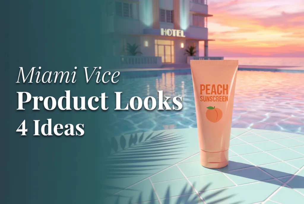
1. Poolside sunscreen on pastel tiles
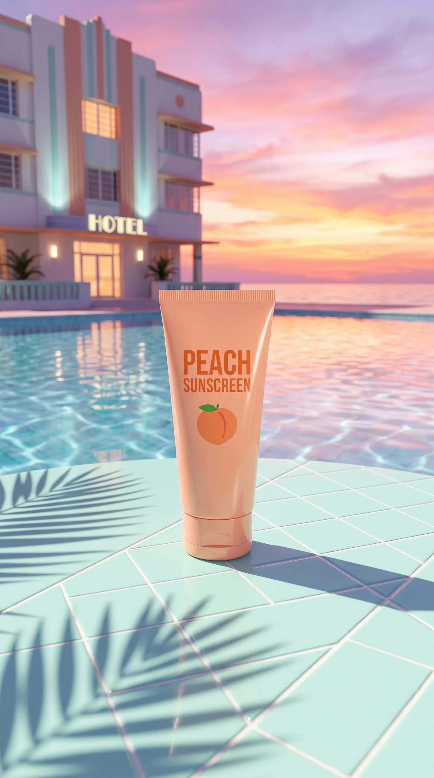
Peach packaging on a pale aqua tiled surface, plus one hard-edged leaf shadow falling from the upper corner, is all it takes to make sunscreen feel vacation-bound. Keep the cap and label facing the camera and let the scene stay sunlit rather than cluttered.
Try a prompt like: premium sunscreen tube standing on pale aqua pool tiles, soft peach backdrop, one crisp palm-leaf shadow, direct summer flash, condensation beads, product label sharp and readable, editorial beauty campaign. If the label starts to warp, drop the condensation. Water beads look great but they fight with small type. Leave one side of the frame open for a price, a three-word benefit, or a short seasonal line. This one suits SPF launches, travel-size bundles, beach-weekend offers, and any carousel that needs a strong first slide.
2. Convertible sneakers on a mint car seat
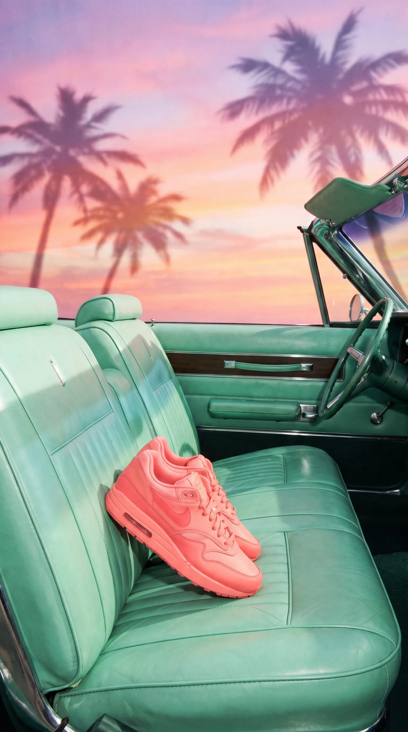
A mint car seat against a coral shoe reads as 1980s Miami in a split second. The trick is keeping the sneaker clearly the product and not a prop. Crop the shoe at a three-quarter angle, then build a spare interior around it: smooth mint upholstery, a strip of chrome, and late-afternoon light. Skip the busy dashboard, which pulls attention away from the shoe.
Prompt to start from: coral lifestyle sneaker on a mint convertible seat, small chrome trim detail, peach sunset light, polished direct flash, 1980s Miami editorial, clean product silhouette, sharp stitching and laces. Match the background color to a real detail on the shoe, like the lace tip or the sole stripe. That link makes the frame feel designed instead of random. Use it for new colorways, limited drops, and paid social that wants fashion energy without a location shoot.
3. Terrazzo fragrance with colored shadow
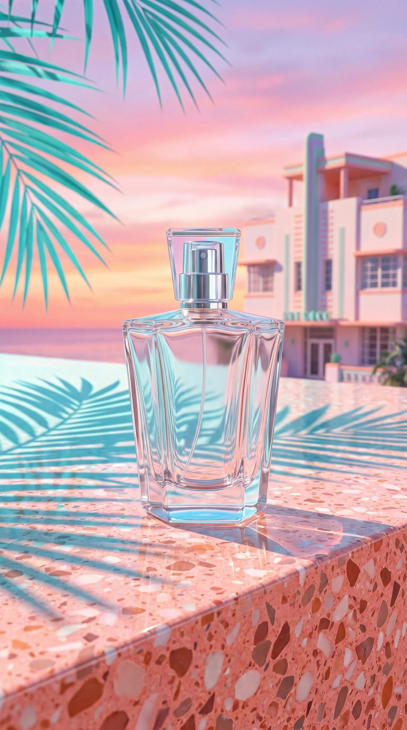
Fragrance wants a quieter version of the palette. Set a clear glass bottle on coral terrazzo, add a pale aqua cast shadow, and keep any reflection short and soft. A big mirror reflection doubles the bottle, weakens the front label, and makes the shot hard to reuse in a grid.
Prompt: clear perfume bottle on coral terrazzo plinth, pale aqua cast shadow, warm direct flash, subtle glass reflection, peach background, luxury summer fragrance campaign, front label crisp. Ask for a plinth rather than a flat surface if the bottle needs shape. A low block gives you a horizon line and separates transparent glass from the background. The finished still works as a launch email header, a collection page hero, or the opening frame of a six-second reel.
4. Wet-tile sunglasses with water reflections
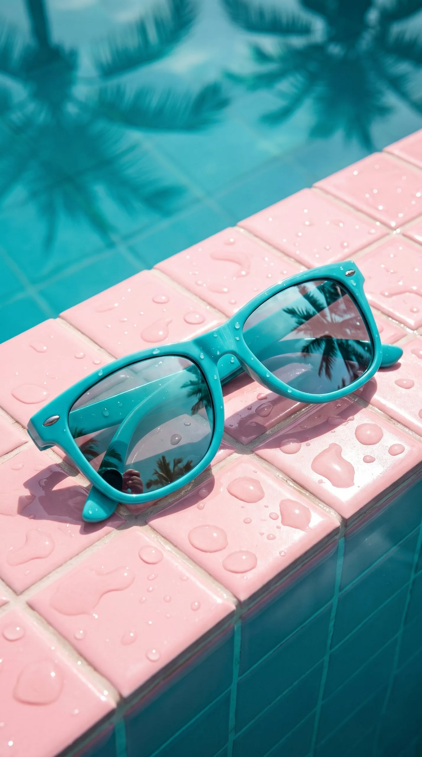
Accessories can take more contrast, so lean into it. Combine wet pool tiles, one palm reflection, and a direct flash. Lay the sunglasses open and angled across the tile. The lenses want a clean highlight, but the frame color has to stay true. Shoot one version with water and one without, because water can darken a pale acetate frame.
Prompt: oversized sunglasses on wet aqua pool tiles, coral reflected light, one palm reflection, crisp direct flash, tiny water ripples, high-end summer accessories ad, frame color accurate. Keep the ripple small and behind the product. Water crossing a lens tends to look accidental in a thumbnail. This look also suits swimwear accessories, phone cases, and drinkware.
Build the look on a phone
The palette rules keep the whole set coherent. Choose two pastels, one dark accent, and one material. A reliable mix is peach plus aqua, navy as the dark note, and either tile, chrome, or terrazzo. More colors than that and the image starts to look like a costume, not a campaign.
Copy this shot brief before you start:
- Start from the real product color, then pick a contrasting background. Coral product gets aqua behind it; pale blue product gets peach or sand.
- Never place a pastel product on the same pastel background unless a shadow, plinth, or reflection clearly separates the edge.
- Make one lighting choice and keep it. Direct flash gives the glossy finish; soft side light reads more like premium beauty.
- Keep the label facing camera and readable at thumbnail size.
- Shoot one clean version with no text so you can reuse it anywhere.
Light does most of the work, so let it. Once you settle on flash or side light, hold that across the product page, the reel cover, and every paid-social crop. That consistency is what makes a handful of phone shots feel like a single launch. For a harder, more electric spin on the same idea, the prism packshot effect for phone ads pushes color and refraction further while keeping the product sharp.
Turn the still into motion
Motion should be brief and obvious. A two-second push-in, a moving leaf shadow, a small water ripple, or a single light sweep is plenty. Do not stack every effect into one clip. If the background, camera, product, and reflection all move at once, the viewer has nowhere to look.
Build a three-shot sequence for vertical ads: open on texture such as wet tile or terrazzo for half a second, cut to the full product for two seconds, then end on a close label shot with the offer or product name. Export a clean version with no text too, since it is easier to reuse in paid ads, stories, and retailer listings. If you would rather animate the still automatically from your phone, our team’s iOS app Prodvid turns a single product photo into short video ads without a full editing timeline.
Where this look earns its keep
This treatment pays off when the product already belongs near leisure, warmth, color, or nightlife. Reach for it on vacation edits, new colorways, limited drops, summer gifting, and launch-week paid social. For a calmer product page, use the cleanest frame as the hero and save the flashier crops for campaign modules.
Always keep one plain packshot in the asset set. After the campaign image catches a shopper’s eye, that neutral reference reassures them about exactly what they are buying.
Key takeaways
- Two pastels, one dark accent, and one material keep the frame coherent instead of costumey.
- Protect label legibility above every retro flourish; the product must stay the hero.
- Contrast the background against the real product color so the edge never disappears.
- Pick one lighting style and hold it across the whole ad set for a unified launch.
- Add motion sparingly and always export one clean, text-free version for reuse.